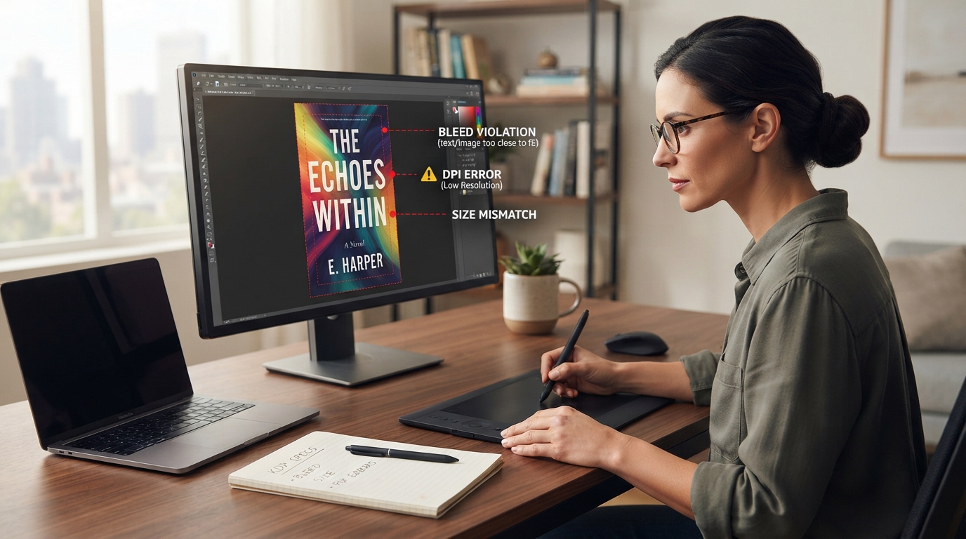
To fix a rejected Amazon KDP book cover, you must ensure your PDF file meets exact mechanical specifications: add 0.125 inches (3.2 mm) of bleed to all outer edges, align spine text precisely with a 0.0625-inch safety margin on both sides, use a minimum 300 DPI resolution, convert color profiles to CMYK, and keep all critical text and images inside the safe zone (0.25 inches from the trim line).
Few things are more frustrating to an indie author than completing a manuscript, finalizing your layout, and hitting “Publish” on Kindle Direct Publishing (KDP), only to receive the dreaded email: “Action Required: Your book cover does not meet our formatting guidelines.”
Amazon’s automated file-checking system is notoriously precise. A discrepancy of even 0.01 inches can trigger a rejection, putting your book launch on hold. Whether you are dealing with a paperback cover error, a hardback wrapping issue, or a Kindle ebook thumbnail glitch, understanding the exact technical requirements of print-on-demand (POD) manufacturing is crucial.
In this comprehensive guide, we will dissect every reason why Amazon KDP rejects covers, provide step-by-step solutions to fix these issues, and share professional production secrets to ensure your cover passes review on the first try. If you want to bypass these technical headaches entirely, partnering with a professional service like Collins Ghostwriting can streamline your publishing journey, ensuring your manuscript and cover are flawlessly formatted to industry standards.
The Anatomy of a KDP Book Cover: Understanding the Grid
To fix a rejected cover, you must first understand how Amazon views your file. Unlike a digital ebook cover, which is a single flat image, a paperback or hardcover cover is a continuous spread consisting of three distinct parts: the Back Cover, the Spine, and the Front Cover.
When you upload your cover PDF, KDP’s ingestion engine overlays a digital template to verify your dimensions. If your visual elements bleed into restricted zones, the system flags it immediately.
Key Terminology Every Self-Publishing Author Must Know
- Trim Size: The final physical dimensions of your printed book (e.g., 6″ x 9″, 5.5″ x 8.5″).
- Bleed: An extra 0.125 inches (3.2 mm) added to the top, bottom, and outer edges of your cover layout. This ensures that when the physical pages are cut to the trim size, no white edges show.
- Live Area (Safe Zone): The safe space where all critical elements (text, logos, primary graphics) must reside. This is usually 0.25 inches (6.4 mm) inside the trim lines.
- Spine Width: The thickness of your book, determined entirely by your page count and paper type (white, cream, or color).
- Trim Lines: The exact lines where the industrial blades will cut your book cover during manufacturing.
The Top 7 Reasons KDP Rejects Book Covers (And How to Fix Them)
1. Incorrect Overall Dimensions (The Bleed Calculation Error)
This is the single most common reason for KDP cover rejection. Authors often design a cover to the exact trim size (e.g., 6″ x 9″) without accounting for the spine width or the mandatory 0.125-inch bleed around the perimeter.
The Fix: You must calculate the exact width and height of your full cover spread using the following formulas:
Full Cover Width Formula:
Bleed + Back Cover Width + Spine Width + Front Cover Width + BleedFull Cover Height Formula:
Bleed + Trim Height + Bleed
For a standard 6″ x 9″ paperback with a 0.4-inch spine, your calculation would look like this:
- Width: 0.125″ + 6″ + 0.4″ + 6″ + 0.125″ = 12.65 inches
- Height: 0.125″ + 9″ + 0.125″ = 9.25 inches
2. Spine Text Drift and Safety Margins
If your book has fewer than 79 pages, Amazon KDP will not allow text on the spine. If your page count is 79 or higher, you can include spine text, but it must have at least 0.0625 inches (1.6 mm) of clearance on both sides of the spine boundaries. If your text is too large or slightly off-center, the cover will be rejected due to the risk of “spine drift” during printing.
The Fix: Center your spine text perfectly. Reduce the font size so there is a visible gap between the text and the edge of the spine. When using KDP’s cover templates, ensure your text sits comfortably within the pink-shaded spine safe zone.
3. Low-Resolution Graphics (The 300 DPI Rule)
Amazon requires all cover files to have a resolution of at least 300 DPI (dots per inch). If you use web-optimized images (which are typically 72 DPI), your printed cover will look blurry, pixelated, and unprofessional. KDP’s pre-flight check will automatically reject files with low-resolution assets.
The Fix: Never use images saved directly from search engines. Ensure all background textures, author photos, and illustrations are high-resolution (300 DPI or vector). In Photoshop, check this under Image > Image Size. In Canva, make sure to export your design as PDF Print (which exports at 300 DPI) rather than PDF Standard.
4. Text Outside the Safe Zone (Live Area Violations)
Even if your overall file size is correct, Amazon will reject your cover if any text (titles, subtitles, author names, reviews, or barcodes) sits too close to the outer edges. This is known as a Live Area violation. If the industrial cutting blades shift slightly during production, text in these zones could be sliced off.
The Fix: Keep all text at least 0.25 inches (6.4 mm) away from the trim lines. This includes the outer edges of the front and back covers, as well as the transition zones where the cover folds into the spine.
| Cover Zone | Minimum Clearance Required | Consequence of Violation |
|---|---|---|
| Outer Edges (Top, Bottom, Sides) | 0.25 inches (6.4 mm) from trim line | Text cut off during trimming; immediate KDP rejection. |
| Spine Sides (Left & Right) | 0.0625 inches (1.6 mm) from spine fold | Text wraps onto the front or back cover due to paper shifting. |
| Barcode Area | 0.25 inches from trim; 2″ x 1.2″ clear box | Barcode overlaps text, making the book unscannable at retail. |
5. Barcode Placement and Obstruction Issues
KDP allows you to either upload your own barcode or have Amazon generate one for you. If you choose the latter, you must leave a blank yellow/white space measuring 2″ wide by 1.2″ high in the lower right corner of your back cover. If you place text, logos, or important design elements in this area, the automated system will reject your file because the barcode will cover them.
The Fix: Move all back-cover copy, social media icons, and publisher logos away from the bottom right quadrant. If you are uploading a custom barcode, ensure it is high-contrast (pure black on a solid white background) and meets GS1 standards.
6. Color Profile Incompatibility (RGB vs. CMYK)
Digital screens display colors using light (RGB), while physical printers use ink (CMYK). If you upload a cover designed in the RGB color space, the colors may shift dramatically when printed, leading to muddy tones, oversaturated neon colors, or loss of detail. KDP accepts RGB files but highly recommends CMYK to avoid unexpected color shifts; however, certain extreme color profiles can cause processing errors.
The Fix: Design your cover in CMYK from the beginning if using professional tools like Adobe Photoshop or Illustrator. If you are using Canva (which defaults to RGB), export as PDF Print and select the “CMYK (best for professional printing)” option if you have Canva Pro. Otherwise, use a free online converter to transition your final PDF to a CMYK profile (specifically GRACoL or Coated FOGRA39 standards).
7. Transparency and Layer Flattening Issues
Complex designs often utilize multiple layers, drop shadows, gradient maps, and transparent elements. When these files are saved as a standard PDF, the vector layers and raster images can render incorrectly in KDP’s print processing queue. This results in missing text, weird white boxes around transparent graphics, or missing background images.
The Fix: Always flatten your artwork before exporting the final PDF. In Adobe Photoshop, click Layer > Flatten Image. Export your final file as a PDF/X-1a:2001 or PDF/X-3. These specific PDF sub-formats are designed for print production and automatically flatten transparencies while preserving color accuracy.
Step-by-Step Diagnostic: How to Fix Your Rejected Cover
If you have received a rejection notice, follow this diagnostic process to find and resolve the error systematically:
Step 1: Download the KDP Template for Your Exact Specifications
Do not guess your spine width. Go to the official KDP Cover Calculator. Enter your exact binding type (paperback/hardcover), interior paper type, page direction, trim size, and exact page count. Download the zip folder containing the PDF and PNG templates.
Step 2: Overlay the Template in Your Design Software
Open your design tool (Photoshop, InDesign, Canva, etc.) and place the downloaded KDP template as the top layer of your document. Lower its opacity to 50% so you can see your design underneath.
Step 3: Align to the Color-Coded Guidelines
Inspect your cover layout against the template’s color zones:
- White Areas: Your design elements must fill these spaces.
- Red/Pink Shaded Areas: Ensure absolutely no text, logos, or essential graphics touch these zones. Only background colors or full-bleed graphics should extend into these areas.
- Black Dotted Line: This is the trim line. Your background must extend past this line to the outer blue line (the bleed limit).
Step 4: Check Font Embedding
Sometimes KDP rejects files because the fonts used in the design are not embedded in the PDF. This means KDP’s printers cannot render the text correctly.
The Fix: Convert all text to outlines (curves/shapes) before exporting, or ensure that “Embed Fonts” is checked in your PDF export settings.
Pro-Level Tips for Flawless KDP Publishing
To ensure you never face another publishing delay, implement these professional design practices:
- Use the PDF/X-1a:2001 Standard: This is the gold standard for print-on-demand. It strips out interactive elements, flattens layers, embeds fonts, and enforces CMYK color spaces.
- Never Use Low-Quality Web Assets: Avoid taking images from social media or standard websites. Use reputable stock libraries or professional illustrators.
- Double-Check Page Count Changes: If you edit your manuscript’s interior formatting and your page count changes by even 3 to 4 pages, your spine width changes. You must recalculate your cover dimensions and adjust your layout accordingly.
- Run a Physical Test Print: Print your cover PDF on a standard home printer at 100% scale. Cut it out with scissors. Wrap it around a book of similar thickness to verify that your spine text aligns perfectly and that no critical text is too close to the edges.
Frequently Asked Questions About KDP Cover Rejections
How long does it take for Amazon KDP to review a revised cover?
Typically, KDP reviews updated covers within 24 to 72 hours. During peak publishing seasons (such as the fourth quarter), manual reviews can take up to 5 business days. Ensure your file is perfect before uploading to avoid resetting this timeline.
Why does KDP say my cover size is incorrect when I designed it to 6×9?
A 6″ x 9″ book cover cannot be uploaded as a 6″ x 9″ file. The uploaded PDF must represent the entire spread: the back cover (6″), the front cover (6″), the spine width (varies by page count), plus the mandatory 0.125-inch bleed on all four outer sides. Your actual file size will be roughly 12.5″ x 9.25″ or larger.
Can I use Canva to design a print-ready KDP cover?
Yes, Canva is highly capable, but you must use the correct export settings. Create a custom-sized canvas using the exact dimensions from the KDP Cover Calculator. When exporting, select PDF Print, check “Crop marks and bleed” (if your layout matches KDP’s bleed margins exactly), and choose CMYK color space.
What is “spine drift” and how can I prevent it?
Spine drift occurs when the paper shifts slightly during the printing and binding process (up to 0.0625 inches in either direction). If your spine text is too large or has no safety margin, it will spill over onto the front or back cover. Prevent this by keeping your spine text small, centered, and well away from the spine folds.
Why does my printed cover look darker than it did on my computer screen?
Computer screens use an active light source (RGB) to make colors pop, whereas physical paper reflects ambient light off ink (CMYK). Colors always look slightly darker and less vibrant in print. To compensate, slightly boost the brightness and contrast of your cover art before exporting the final CMYK PDF.