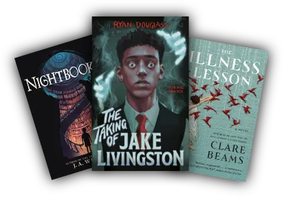

To format a book, you must structure your raw manuscript into an industry-standard layout by configuring page dimensions (trim size), establishing consistent margins and gutters, styling clean typography with proper hierarchy, and organizing front, body, and back matter sections. Whether preparing an EPUB for digital readers or a print-ready PDF for Amazon KDP, IngramSpark, or traditional houses, formatting bridges the critical gap between a rough draft and a polished, commercially viable publication.
Every author eventually reaches the pivotal crossroad of publishing and asks the defining question: how do I format a book that captivates readers and meets rigorous industry standards? The visual presentation of your text directly influences reader retention, critical reviews, and sales performance. A poorly formatted book with misaligned margins, inconsistent paragraph indents, or clashing typefaces immediately signals amateur production, pulling the reader out of the narrative. Conversely, meticulous typesetting creates an effortless, immersive reading experience across both physical paperbacks and modern e-readers.
The Core Fundamentals of Professional Book Anatomy
Before adjusting page setups or embedding fonts, you must understand the anatomical breakdown of a commercially published book. A book is not simply a continuous block of text; it is divided into three distinct sections, each adhering to specific typographical and layout conventions.
| Book Section | Standard Elements Included | Pagination & Layout Style |
|---|---|---|
| Front Matter | Title Page, Copyright Page, Dedication, Epigraph, Table of Contents, Foreword, Preface | Numbered with lowercase Roman numerals (i, ii, iii) or unnumbered; chapters usually start on a right-hand (recto) page. |
| Body Matter | Prologue, Main Chapters, Epilogue, Author’s Notes (Narrative) | Arabic numerals (1, 2, 3) starting at Chapter 1; includes running headers, footers, and section breaks. |
| Back Matter | Acknowledgments, Author Biography, Appendices, Glossary, Bibliography, Index, Call-to-Action | Continues Arabic pagination from body matter; often formatted with flexible, utilitarian layouts. |
Front Matter Architecture
The front matter serves as the formal doorway to your manuscript. It establishes ownership, legal protections, and thematic framing. The essential components include:
- Half Title Page: Features solely the main title of your book, omitting the subtitle and author name.
- Title Page: The full title, subtitle, author name, and publisher imprint or logo.
- Copyright Page: Contains the copyright notice, ISBNs (print and digital), Library of Congress Control Number (LCCN), disclaimer text, edition notice, and printing details.
- Dedication & Epigraph: Short, centered passages honoring someone or providing an evocative quote that sets the book’s tone.
- Table of Contents (TOC): Vital for non-fiction and highly recommended for complex fiction. For digital books, this must be hyperlinked.
Body Matter and Flow Hierarchy
The body matter is where your core manuscript lives. Professional layout artists utilize section breaks (not regular page breaks) between chapters to reset running headers and control page numbering. Ensuring your narrative transitions smoothly often requires the trained eye of book editors for hire before laying out the final pages, guaranteeing that structural revisions do not disrupt the typesetting downstream.
Back Matter Components
The end of your manuscript is a powerful marketing asset. In self-publishing and trade publishing alike, the back matter should house:
- Author Bio: A brief professional summary with an author photo.
- Call-to-Action (CTA): Links to sign up for your newsletter, leave an honest review, or pre-order the next installment.
- Index and Reference Tables: Essential for academic, educational, and non-fiction titles.
Standard Print Book Dimensions and Trim Sizes
Choosing the right trim size (the physical dimensions of your printed book) dictates manufacturing costs, distribution feasibility, and reader expectations. Trim sizes are measured in inches (width × height).
| Genre / Category | Standard Trim Size (Inches) | Best Suited Distribution Channel |
|---|---|---|
| Mass Market Fiction | 4.25 × 6.87 | Traditional Trade, Newsstands, Direct Retail |
| Standard Trade Paperback (Fiction) | 5 × 8 to 5.5 × 8.5 | Amazon KDP, IngramSpark, Global Distribution |
| Memoir & General Non-Fiction | 6 × 9 | KDP, IngramSpark, Barnes & Noble Press |
| Textbooks & Technical Manuals | 7 × 10 to 8.5 × 11 | Academic Publishers, Print-on-Demand (POD) |
| Children’s Illustrated Books | 8.5 × 8.5 or 8.5 × 11 | Specialty Color POD, Offset Printing |
Margins, Gutters, and Page Geometry
A frequent error among beginner authors is ignoring the “gutter.” The gutter margin is the extra space added to the inside edge of a page to ensure the text does not disappear into the spine binding when the book is opened.
For custom layouts and intricate print specifications, working with professional services like Book Formatting guarantees your margins and page structures meet the absolute tolerances required by top-tier print-on-demand networks and commercial offset presses.
| Page Count Range | Inside Gutter Margin | Outside Margin | Top & Bottom Margins |
|---|---|---|---|
| 24 to 150 Pages | 0.375 in (9.5 mm) | 0.5 in (12.7 mm) | 0.5 in to 0.75 in |
| 151 to 300 Pages | 0.5 in (12.7 mm) | 0.5 in to 0.625 in | 0.5 in to 0.75 in |
| 301 to 500 Pages | 0.625 in (15.9 mm) | 0.625 in (15.9 mm) | 0.75 in (19 mm) |
| 500+ Pages | 0.75 in to 0.875 in | 0.75 in (19 mm) | 0.75 in to 1.0 in |
Step-by-Step: How Do I Format a Book for Print Publication?
Formatting a print interior requires exact mathematical precision and typographic control. Follow this practical, phase-by-phase workflow to construct an industry-compliant print PDF.
- Set Document Geometry: Open your layout engine (Adobe InDesign, Affinity Publisher, or Microsoft Word). Select your final trim size and enable Facing Pages (Mirrored Margins). Input your exterior margins and gutter calculations based on your total word count projection.
- Establish Typographical Rules:
- Select a legible, classic body serif such as Garamond, Minion Pro, Caslon, or Sabon.
- Set font size to 10pt, 10.5pt, or 11pt with proportional leading (line spacing) between 12pt and 14pt. Never use single or double line spacing; use exact point values.
- Apply full justification to all narrative paragraphs with hyphenation controls activated to avoid loose lines.
- Configure Indentation and Paragraph Styles:
- Set first-line indents to 0.2 inches (or 0.3 inches maximum). Do not use the “Tab” key or spaces to indent.
- Ensure that the first paragraph of every new chapter or scene break has no indent (First-Line Indent: 0). You may optionally use a drop cap or small caps for the first 3–5 words.
- Implement Headers, Footers, and Recto/Verso Rules:
- Ensure chapter openings begin on a Recto (right-hand) page.
- Suppress running headers on chapter opening pages, blank pages, and front matter.
- Configure alternating headers: Left page (Verso) shows Book Title or Author Name; Right page (Recto) displays Chapter Title.
- Eliminate Typesetting Errors:
- Widows: A single word or short line appearing alone at the top of a page.
- Orphans: The first line of a paragraph appearing alone at the bottom of a page.
- Rivers: Gaps in text alignment that create noticeable white vertical trails through justified blocks.
- Export as PDF/X-1a:2001 or PDF/X-3: This flattens transparency, embeds all font subsets, and preserves vector clarity at 300 DPI for commercial-grade printing presses.
Formatting for Digital: E-Books, EPUBs, and MOBI
Formatting for digital devices is fundamentally different from print typesetting. While print is fixed-layout, e-books rely on reflowable text. The reader controls the font choice, size, screen orientation, and lighting conditions. For authors navigating the digital publishing ecosystem, leveraging specialized ebook publishing services helps resolve technical code validation errors across Apple Books, Kobo, and Amazon Kindle.
Reflowable vs. Fixed-Layout E-Books
- Reflowable Layout: The global standard for novels, non-fiction, memoirs, and business books. Text adapts fluidly across smartphones, tablets, and dedicated e-ink displays.
- Fixed Layout: Used exclusively for highly visual works such as children’s picture books, comic books, graphic novels, and complex cookbooks where image placement must match exact coordinates.
Key Rules for Clean EPUB Formatting
- Use Clean Semantic HTML/CSS: Use standard tags (
<h1>,<h2>,<p>) rather than inline hard styles to avoid breaking device rendering engines. - Never Use Hard Page Breaks: Replace manual returns with semantic CSS page break rules (
page-break-before: always;). - Convert Images to RGB: Set all internal illustrations or diagrams to sRGB color mode, 72–300 DPI, with maximum file compression to stay below digital delivery fee thresholds.
- Build a NCX / Logical Table of Contents: An interactive navigation file allowing readers to jump between chapters via their e-reader’s system menu.
Software Comparison: Tools for Formatting Your Book
Selecting the right software depends on your budget, technical proficiency, and publishing goals. Below is an objective analysis of leading book formatting applications.
| Software | Target Platform | Learning Curve | Best Used For |
|---|---|---|---|
| Adobe InDesign | Mac & Windows | Advanced / High | Industry-standard print typesetting, complex non-fiction, illustrated layouts. |
| Vellum | macOS Only | Low / Intuitive | Indie fiction and non-fiction authors wanting fast, elegant EPUBs and clean print layouts. |
| Atticus | Web, Mac, Windows, Chrome | Low to Moderate | All-in-one writing and cross-platform formatting alternative to Vellum. |
| Microsoft Word | Mac & Windows | Moderate | Basic manuscript formatting and entry-level print PDF generation using templates. |
| Scrivener | Mac & Windows | Moderate / High | Long-form writing, research organization, and dynamic file compilation for e-books. |
| Sigil / Calibre | Open Source (Cross-Platform) | Advanced (Requires HTML/CSS) | Direct EPUB code manipulation, fine-tuning styling rules, and deep validation. |
Typography Rules for High-End Readability
Professional typography is invisible. When done right, the reader absorbs the narrative without noticing the mechanics of the typeface. When done poorly, eye fatigue sets in quickly.
Selecting the Right Typeface
- Fiction: Classical serifs provide fluid eye movement. Recommended fonts include Baskerville, Crimson Text, Adobe Caslon Pro, Sabon, and Palatino.
- Non-Fiction & Technical: Modern, clear serifs or clean sans-serif accents for subheadings. Recommended combinations include Minion Pro (Body) with Helvetica Neue or Gill Sans (Headers).
- Avoid Problematic Typefaces: Never format your main body text in Times New Roman (designed for narrow newspaper columns, not books), Arial, Comic Sans, or Courier.
Spacing, Leading, and Kerning Best Practices
- Leading (Line Spacing): Set line height to roughly 120%–130% of your font size (e.g., 10pt font should have 12pt to 13pt leading).
- Paragraph Spacing: Standard fiction uses first-line indents with 0pt space between paragraphs. Non-fiction may utilize block styling (no indent, with 4pt–6pt paragraph spacing after).
- Em-dashes and Hyphens: Use proper em-dashes (—) without spaces around them for narrative breaks, en-dashes (–) for number ranges (e.g., 1939–1945), and hyphens (-) strictly for compound words.
Integrating Formatting with Overall Self-Publishing Strategy
Interior book formatting represents one component of a larger publishing pipeline. Formatting cannot be viewed in isolation; it must align perfectly with your exterior presentation and overall retail architecture.
A beautifully formatted interior must be paired with an equally stunning exterior cover that meets exact spine width and bleed specifications. Aligning with skilled professionals for your book cover design services ensures your physical product matches the quality of traditionally published bestsellers on the bookstore shelf.
Frequently Asked Questions About Book Formatting
Can I format a book myself in Microsoft Word?
Yes. Word can produce acceptable print-ready PDFs and basic e-books if you correctly utilize Paragraph Styles, Section Breaks, Mirrored Margins, and custom Page Sizes. However, Word lacks precision controls for tracking, optical kerning, baseline grids, and advanced hyphenation dictionaries, making dedicated layout tools or professional formatters preferable for commercial releases.
What is the difference between a page break and a section break?
A page break simply shifts following text to the top of the next page while keeping all margins, headers, and footers identical. A section break creates an independent zone within the document, allowing you to alter page orientations, unlink running headers, change margin sizes, or restart page numbering sequences between chapters.
How much does professional book formatting typically cost?
Professional interior book formatting generally ranges between $150 to $600 for standard fiction and narrative non-fiction, depending on word count and the complexity of the chapter headings. Complex non-fiction with tables, footnotes, callout boxes, and illustrations can range from $500 to $1,500+ depending on total layout requirements.
Why do my images look blurry in print but clear on my screen?
Computer screens display images at 72 to 96 DPI (Dots Per Inch), whereas commercial printing processes require 300 DPI at actual output size. If you place a web-resolution image into a print interior, the printer does not have enough pixel density to render crisp lines, resulting in visible pixelation and blurriness.
Final Formatting Checklist Before Publication
Review this final operational checklist before uploading your interior files to distribution platforms:
- ☐ Trim size and margins match distributor specifications (KDP, IngramSpark).
- ☐ Gutter margin is correctly set based on final calculated page count.
- ☐ All fonts are fully embedded within the exported PDF/X file.
- ☐ Front matter pagination uses Roman numerals; Chapter 1 starts on Arabic Page 1.
- ☐ Running headers alternate accurately between recto and verso pages without appearing on chapter opening pages.
- ☐ First paragraphs of chapters/scenes have zero first-line indents.
- ☐ Widows and orphans have been resolved through manual line adjustments.
- ☐ All images are verified 300 DPI in CMYK (print) or sRGB (e-book).
- ☐ Hyperlinks and NCX TOC are verified fully operational inside an EPUB reader engine.