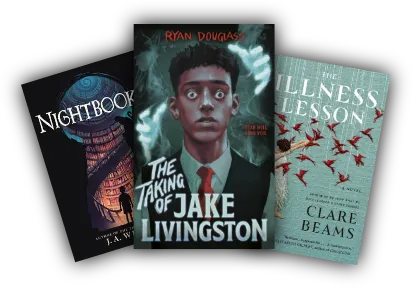
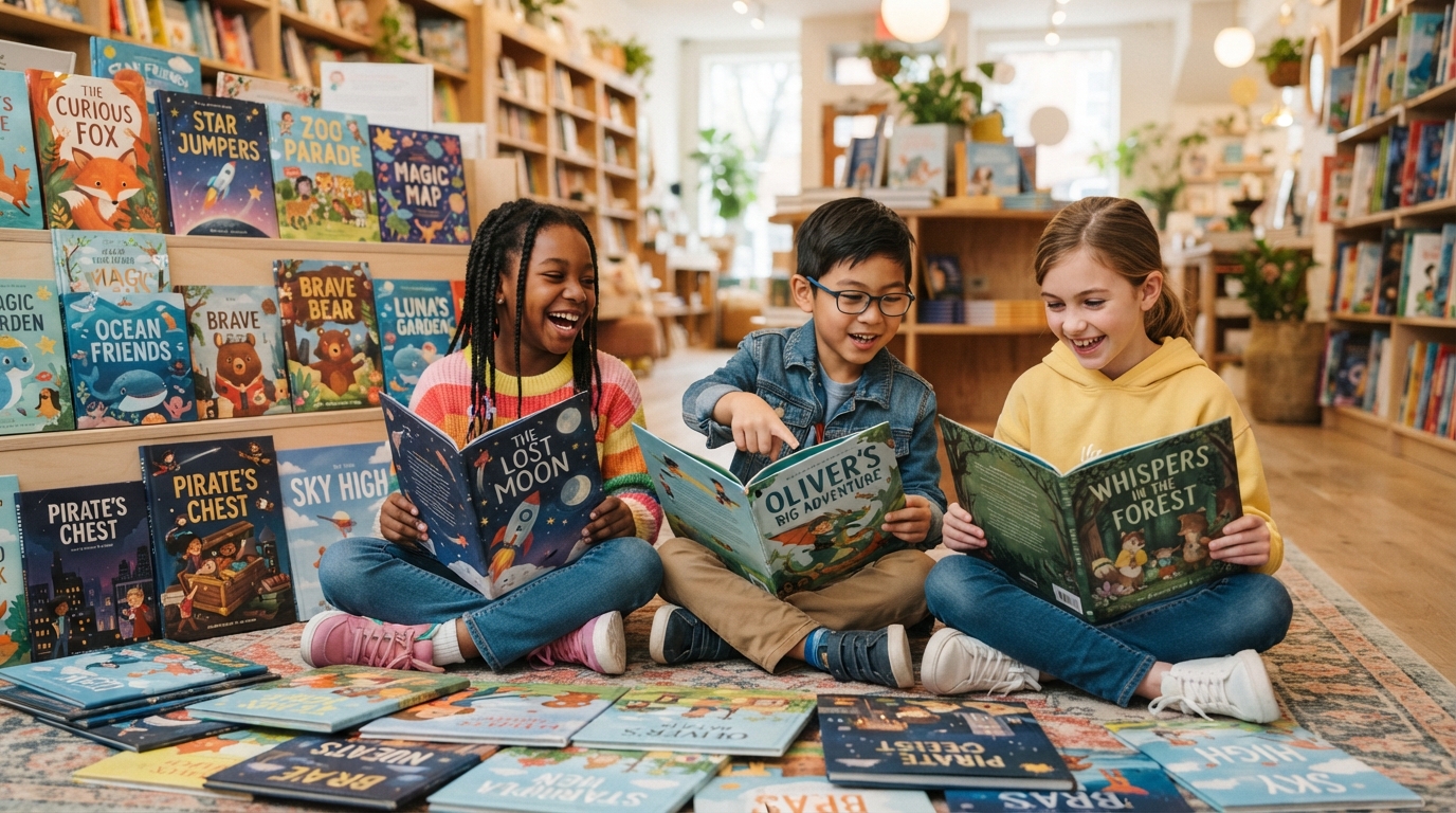
To attract young readers and significantly boost book sales, a kids’ book cover must master the dual-audience dilemma by appealing to both the child’s imagination and the parent’s purchasing intent. The definitive formula for a high-converting children’s book cover combines high-contrast color psychology, a singular emotional focal point (usually an expressive character looking directly at the viewer), custom age-appropriate typography, and structural optimization for digital thumbnails. By aligning your visual assets with precise age-group expectations—from high-contrast board books for toddlers to action-oriented illustrations for middle graders—you create an immediate emotional connection that drives clicks, page reads, and physical purchases.
The Dual-Audience Dilemma: Who Are You Designing For?
Designing a children’s book cover is one of the most complex challenges in modern publishing because you are never selling to a single demographic. You must capture the attention of two completely different audiences with vastly different cognitive processing styles: the gatekeeper (parent, educator, librarian) and the consumer (the child).The gatekeeper looks for educational value, safety, emotional resonance, readability, and structural durability. They scan the cover for age-appropriateness, genre markers, and themes that align with their developmental goals for the child. The child, on the other hand, is driven entirely by immediate sensory stimulation, character relatability, humor, adventure, and curiosity. If your cover only appeals to parents, it will sit on the shelf gathering dust because the child will refuse to read it. If it only appeals to children but looks amateurish or chaotic, the parent will never open their wallet. To achieve commercial success, your cover must act as a bridge between these two worlds.
Age-Specific Design Blueprint: From Toddlers to Middle Grade
Children’s literature is not a monolith. A cover design that works perfectly for a five-year-old will fail miserably for a ten-year-old. Visual preferences, reading comprehension, and psychological needs shift dramatically every few years.
| Target Age Group | Primary Book Format | Dominant Design Style | Typography Focus | Core Emotional Driver |
|---|---|---|---|---|
| 0 to 3 Years | Board Books | High-contrast, simple shapes, primary colors, minimal backgrounds | Ultra-bold, rounded, sans-serif, massive scale | Sensory recognition, safety, and comfort |
| 3 to 7 Years | Picture Books | Richly detailed illustrations, expressive characters, whimsical settings | Playful, hand-drawn, integrated into the artwork | Wonder, humor, curiosity, and emotional connection |
| 5 to 9 Years | Early Readers / Chapter Books | Action-oriented, character-focused, transition from full illustration to spot art | Clean, highly legible, slightly stylized serif or sans-serif | Achievement, independence, and light adventure |
| 8 to 12 Years | Middle Grade | Cinematic compositions, atmospheric lighting, mystery or fantasy elements | Sophisticated, textured, heavily stylized, often 3D or distressed | Identity, belonging, high-stakes adventure, and mystery |
Designing for Board Books (Ages 0-3)
For the youngest demographic, cognitive development is centered on sensory input and basic pattern recognition. Covers must utilize high-contrast color palettes (often featuring black, white, red, and primary colors) to stimulate developing retinas. Complex backgrounds are a distraction; instead, place a single, highly recognizable object or character front and center. The typography must be exceptionally thick and friendly, with rounded corners to mimic the safe, soft nature of the physical book itself.
Mastering Picture Book Covers (Ages 3-7)
Picture books are the sweet spot of children’s publishing, where illustration quality is paramount. Here, the cover must tell a mini-story in a single frame. The main character should display a clear, intense emotion—whether it is wide-eyed curiosity, mischievous joy, or comforting warmth. The artwork needs to be rich enough to reward repeat viewings, as children in this age bracket love to re-read their favorite books dozens of times. Typography should feel organic to the art style, often using custom hand-lettering that curves or bounces along with the rhythm of the illustration.
Crafting Chapter Book Covers (Ages 5-9)
As children transition to reading independently, they seek a sense of accomplishment. Chapter book covers should look slightly more mature than picture books to signal this developmental milestone. The artwork often features the protagonist in the middle of a specific action or dilemma. The typography becomes more structured, moving toward clean, legible fonts that help young readers practice word recognition on the cover itself.
Elevating Middle Grade Covers (Ages 8-12)
Middle grade readers are highly sensitive to anything that looks “babyish.” They want books that look sophisticated, mysterious, and cinematic. The cover designs should focus on world-building, atmospheric lighting, and high-stakes scenarios. Think silhouettes against glowing horizons, magical artifacts emitting light, or a group of diverse friends facing a grand adventure. The typography should be highly stylized, often incorporating textures like wood, metal, or stone to match the genre (e.g., fantasy, adventure, or historical fiction).
The Science of Color Psychology in Children’s Publishing
Color is the first element the human brain processes when looking at a book cover, long before it registers the title or the specific characters. In children’s publishing, colors carry deep psychological weight and trigger instantaneous emotional responses.
- Warm Yellows and Oranges: These hues project happiness, optimism, energy, and warmth. They are exceptionally effective for lighthearted, humorous, and friendship-driven stories.
- Vibrant Blues and Teals: Blue evokes trust, calm, and stability, making it a staple for bedtime books. Brighter teals and turquoises suggest magic, fantasy, and underwater adventures.
- Lush Greens: Green represents growth, nature, exploration, and mystery. It is the go-to color for outdoor adventures, animal stories, and environmental themes.
- Rich Purples and Magics: Purple has long been associated with magic, royalty, mystery, and the supernatural. It is highly effective for fantasy novels and whimsical fairy tales.
- High-Contrast Highlighting: Using complementary colors (such as orange against a deep blue sky) creates visual tension that immediately draws the eye to the focal point of your cover.
When designing, keep the target medium in mind. A cover that looks brilliant in RGB on an iPad screen may look dull and muddy when printed in CMYK on matte paper. Always test your color profiles early in the design phase to ensure vibrancy across both digital and physical formats.
The Anatomy of a High-Converting Book Cover
To systematically build a cover that drives conversions, you must understand how the eye travels across a cover layout. This is known as visual hierarchy.
The human eye naturally scans a cover in a “Z” pattern, starting at the top left, moving across to the top right, sweeping down diagonally to the bottom left, and finishing at the bottom right. Your key elements must align with this natural cognitive flow.
1. The Emotional Focal Point
Your cover must have one dominant focal point that occupies at least 40% to 50% of the visual space. In kids’ books, this is almost always the protagonist’s face—specifically, their eyes. Humans are biologically programmed to look at eyes. If your character is making direct eye contact with the viewer, it creates an instant empathetic connection, urging the browser to stop scrolling and click.
2. Integrated, Legible Typography
The book title must be readable even when shrunk down to a tiny thumbnail on an Amazon search results page. Avoid overly thin, highly decorative, or cursive fonts that blur together at small sizes. Ensure there is extreme contrast between the text color and the background illustration. If necessary, use drop shadows, outer glows, or physical banners behind the text to separate it from the artwork.
3. The Promise of the Genre
Within a fraction of a second, your cover must communicate its genre. If it is a funny book, the character should be in a comical pose with bright, wacky colors. If it is a fantasy book, the cover should feature magical elements, deep shadows, and glowing lights. If it is an educational science book, the layout should be cleaner, featuring realistic diagrams or crisp, bold vector graphics.
Optimizing for the Digital Shelf: The Thumbnail Test
Most book purchases today begin on a digital screen. Whether a parent is browsing Amazon, Epic!, or Goodreads, your book cover will first be seen as a tiny thumbnail image, often no larger than a postage stamp on a mobile device.To ensure your cover performs exceptionally well in digital marketplaces, apply these optimization strategies:
- The squint test: Shrink your cover design down to 100 pixels wide on your screen. Squint your eyes. Can you still tell what the main image is? Is the title still legible? If the cover turns into an unrecognizable blur of colors, your design is too complex.
- Simplify the background: Busy backgrounds with dozens of minor details get lost in thumbnail view. Strip away non-essential elements to let the main character and title breathe.
- Maximize title size: Do not be afraid to let the title take up a third of the entire cover space. In digital retail, the title on the cover is often more readable than the metadata text next to it.
- Test against competitors: Take a screenshot of the Amazon bestseller list in your specific sub-genre. Photoshop your draft cover into the middle of that list. Does your book pop out, or does it fade into the background?
How to Collaborate with Illustrators and Designers
Unless you are an accomplished professional illustrator yourself, you should never attempt to draw your own children’s book cover. The market is highly competitive, and self-published books must match the aesthetic standards of major traditional publishing houses to succeed.When preparing to hire a professional, partnering with professional literary agencies and book production services like Collins Ghostwriting ensures your visual assets are handled by industry veterans who understand current market trends and formatting standards. They can guide you through the process of translating your manuscript’s core themes into a striking visual concept.When drafting a design brief for your illustrator, make sure to include:
- Precise Dimensions and Bleed: Specify whether the book is square (e.g., 8.5″ x 8.5″), portrait (e.g., 6″ x 9″), or landscape, along with the exact spine width based on your final page count and paper weight.
- Character Reference Sheets: Provide detailed descriptions of the protagonist’s physical features, clothing, key expressions, and personality traits.
- Color Palette Preferences: Share mood boards or examples of existing books whose color schemes match the emotional tone you want to set.
- Layout and Text Placement: Clearly indicate where the title, subtitle, and author name will go so the illustrator leaves “dead space” (areas with low detail) to accommodate the typography.
Real-Time Search Queries: What Parents and Educators Are Looking For
Understanding search intent is vital for positioning your book cover and metadata. When parents and educators search for children’s books, they use highly specific, intent-driven queries. Your cover must visually answer these queries instantly.
| User Search Query | Underlying Search Intent | Visual Cover Solution |
|---|---|---|
| “books to help kids deal with anxiety” | Emotional support, coping mechanisms, gentle guidance | Soft, pastel colors, comforting characters hugging a plush toy or parent, calm typography |
| “funny books for reluctant readers age 7” | Entertainment, high-energy, easy-to-digest content | Zany, cartoonish illustrations, bright neon accents, expressive/silly faces, dynamic action lines |
| “diverse STEM books for elementary school” | Representation, educational value, modern themes | Diverse characters using scientific tools, magnifying glasses, stars, crisp clean vector layouts |
| “bedtime stories for toddlers” | Calming down, sleep association, gentle transition | Deep blue/purple night skies, crescent moons, sleeping animals, soft-edged glowing elements |
Common Pitfalls in Self-Published Kids’ Book Covers
Avoid these frequent mistakes that instantly signal “amateur” to potential buyers:
Using Cliché or Overused Fonts
Using standard system fonts like Comic Sans, Papyrus, or basic Times New Roman screams amateur. Invest in professional, commercial-use display fonts or work with a designer who can hand-letter your title. The typography should feel as unique as the story itself.
Cluttering the Cover with Too Many Characters
It is tempting to put every single character from your story on the cover to show off your cast. This is a critical mistake. It dilutes the visual impact and confuses the viewer. Stick to one or two main characters to keep the composition clean and powerful.
Poor Contrast and Readability
Putting yellow text over a light green background or dark blue text over a black night sky makes your title impossible to read. Always prioritize high contrast. If your background is busy, use a solid color block, a subtle banner, or a heavy drop shadow to make your text pop.
Ignoring Spine and Back Cover Design
While the front cover gets the initial click, the spine and back cover close the sale in physical bookstores. The spine must have clear, readable text that stands out when shelved vertically. The back cover should continue the illustration style seamlessly, leaving ample room for a compelling book blurb, reviews, and a clean barcode area.
The Ultimate Pre-Launch Cover Design Checklist
Before you finalize your cover design and send it to print or upload it to digital distributors, run through this comprehensive checklist to ensure maximum market readiness.
- [ ] Readability: Is the title easily readable from across a room?
- [ ] Thumbnail Test: Does the cover remain clear and striking when scaled down to 100 x 100 pixels?
- [ ] Target Audience Alignment: Does the artwork accurately reflect the specific age group of your readers?
- [ ] Genre Accuracy: Does the style immediately communicate whether the book is fiction, non-fiction, fantasy, or humor?
- [ ] Emotional Hook: Does the protagonist have an expressive face that makes direct eye contact with the viewer?
- [ ] Color Harmony: Are the colors vibrant, complementary, and professionally balanced?
- [ ] Technical Specifications: Is the file in high-resolution (300 DPI), using the correct CMYK color profile for print, with proper bleed margins?
- [ ] Spine and Back Optimization: Are the spine text and back cover layout clean, professional, and properly formatted for the barcode?
Frequently Asked Questions About Children’s Book Covers
How much does a professional children’s book cover design cost?
The cost of a professional children’s book cover varies widely based on the complexity of the illustration and the experience of the designer. Generally, hiring a professional illustrator and cover designer ranges from $500 to $2,500. This investment is crucial because the cover is your primary marketing tool.
Should I use stock illustrations for my kid’s book cover?
While stock illustrations are budget-friendly, they are highly discouraged for children’s books. Stock art lacks unique character consistency, meaning you won’t be able to show the same character in different poses throughout the book. Custom illustration is essential for building a recognizable brand and character.
What size should a children’s book cover be?
The most common industry standard sizes for children’s picture books are 8″ x 8″, 8.5″ x 8.5″, or 8″ x 10″. For middle-grade novels, standard sizes are typically 5″ x 8″ or 5.5″ x 8.5″. The right size depends on your target age group and the layout of your internal illustrations.
How do I know if my cover design is working?
You can run A/B testing using digital ads (like Facebook or Amazon Ads) targeting parents. Run two identical ads with different cover designs and see which one gets a higher Click-Through Rate (CTR). You can also gather feedback from parent-teacher groups, librarians, and children within your target demographic before launching.